Most candlestick patterns tell a story after the fact. The hammer is different — it captures the exact moment sellers lose control.
It forms after a price decline, when sellers push the market lower during a session but fail to hold that pressure into the close. By the end of the candle, buyers have stepped in and driven the price back near the top of its range. That rejection of lower prices is what gives the hammer its potential bullish reversal meaning.
For traders studying candlestick charts across forex, shares, commodities, and indices — including widely traded instruments such as gold and currency pairs like USD/INR — the hammer stands out because its structure is simple to recognise and easy to interpret. It does not confirm a reversal on its own, but it can act as a useful visual clue that selling pressure may be weakening.
Key Points
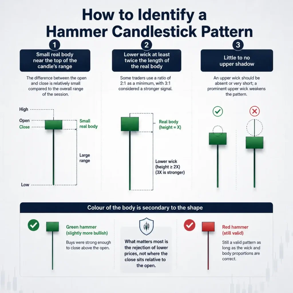
- The hammer candlestick pattern is a single-candle bullish reversal signal that forms at the end of a downtrend, characterised by a small real body near the top of the range and a lower wick at least twice the length of the body.
- Context determines whether a hammer is meaningful — the same candle shape in an uptrend is called a hanging man and may carry the opposite implication, which is why trend and support alignment matter before acting on the pattern.
- Traders often seek confirmation from the next candle, volume levels, and technical indicators such as the Relative Strength Index (RSI) before treating a hammer as a trade signal, since the pattern can produce false reversals when used in isolation.
What Is the Hammer Candlestick Pattern?
The hammer candlestick pattern is a single-bar bullish reversal signal that appears after a sustained price decline. It is defined by a small real body positioned near the top of the candle’s range, a lower shadow (or wick) that is at least twice the length of the body, and little to no upper shadow. The pattern gets its name from its resemblance to a hammer — the body forms the head and the long wick forms the handle.

The core logic behind the pattern is straightforward. During the session, sellers push the price significantly lower — extending the existing downtrend. Then buyers step in, absorbing the selling pressure and pushing the price back up toward the open. The candle closes near the top of its range, with the long lower wick as a record of how far sellers managed to push the price before buyers forced a recovery.
Candlestick charting traces its origins to 18th-century Japan, where rice trader Munehisa Homma developed early versions of the technique [1]. The hammer is one of the oldest and most studied single-candle patterns in this tradition, and remains widely used across forex, equities, commodities, and index markets.
Gold, in particular, is often cited as an asset where the hammer pattern appears with notable clarity — its price behaviour around key support levels often produces well-defined hammer formations that technical analysts watch closely.
The Three Structural Rules
A valid hammer must meet three structural criteria:
- Small real body near the top of the candle’s range — the difference between the open and close is relatively small compared to the overall range of the session
- Lower wick at least twice the length of the real body — some traders use a ratio of 2:1 as a minimum, with 3:1 considered a stronger signal
- Little to no upper shadow — an upper wick should be absent or very short; a prominent upper wick weakens the pattern by suggesting sellers pushed back late in the session
The colour of the body — whether the candle closes higher (green/bullish) than it opened, or lower (red/bearish) — is secondary to the shape.
- A green hammer is considered slightly more bullish because it shows buyers were strong enough to close above the open.
- A red hammer still qualifies as a valid pattern, provided the wick and body proportions are correct.
What matters most is the rejection of lower prices, not where the close sits relative to the open.
The Market Psychology Behind It
Each hammer candle encodes a sequence of events. Sellers open the session in control, driving the price lower and extending the prevailing downtrend. At some point — often near a recognised support level — buyers begin to absorb the selling pressure. They push the price back upward, erasing most or all of the session’s decline. The close lands near the top of the range.
What this tells observant traders is that lower prices were tested and rejected. The market extended into a new low, found no sustained selling interest, and reversed. This exhaustion of selling pressure is what gives the hammer its potential bullish implication — though it is not a guarantee of a reversal. The pattern marks a moment worth watching, not a certainty.
How to Identify a Hammer Candlestick on a Chart
Identifying a hammer candlestick involves checking four conditions in sequence: the prior trend, the candle’s proportions, the upper wick, and the position of the body within the range.
Step 1 — Confirm the Prior Downtrend
A hammer is only meaningful after a discernible price decline. Without a prior downtrend, the candle shape carries no directional implication. Traders typically look for a series of lower highs and lower lows, or a notable drop from a recent swing high.
A candle that looks structurally like a hammer but appears during a sideways market or within an uptrend is not treated as a bullish hammer — in an uptrend, the same shape becomes a hanging man with a different implication entirely.
Step 2 — Measure the Body-to-Wick Ratio
The lower wick should be at least twice the length of the real body. To measure this, subtract the open or close (whichever is lower) from the low of the candle to get the wick length, then compare it to the absolute difference between the open and close.
A wick that is only 1.5× the body is borderline; a wick that is 3× or more is a textbook hammer. If the body is very large relative to the total range, the pattern loses its meaning — it starts to look more like a regular bearish or bullish candle, not a hammer.
Step 3 — Check the Upper Shadow
The upper shadow should be very short or absent. A significant upper shadow suggests sellers pushed back late in the session, which muddies the bullish message. When an upper wick is present and prominent, the pattern may be closer to a spinning top or a different formation than a clean hammer.
Step 4 — Assess the Broader Context
Even a structurally perfect hammer carries more weight when it forms at a price level that already matters — a previous swing low, a Fibonacci retracement level, a round-number price, a 50- or 200-day moving average, or a well-established horizontal support zone.
When the pattern forms at one of these levels, the rejection of lower prices aligns with a technical area where buyers were already expected to appear. That alignment strengthens the signal.

Hammer vs Related Candlestick Patterns
Several candlestick patterns share visual similarities with the hammer. The critical difference in every case is context — specifically, whether the pattern appears at the top or bottom of a trend.
| Pattern | Appears After | Signal | Body Position | Key Shadow |
| Hammer | Downtrend | Bullish reversal | Near top of range | Long lower wick (≥2× body) |
| Inverted Hammer | Downtrend | Bullish reversal (weaker) | Near bottom of range | Long upper wick (≥2× body) |
| Hanging Man | Uptrend | Bearish reversal | Near top of range | Long lower wick (≥2× body) |
| Shooting Star | Uptrend | Bearish reversal | Near bottom of range | Long upper wick (≥2× body) |
| Dragonfly Doji | Either | Indecision / possible reversal | At open/close (no body) | Long lower wick, no upper wick |

Hammer vs Inverted Hammer
The inverted hammer is a bullish reversal pattern that also appears at the bottom of a downtrend. It is the structural opposite of the standard hammer: the small body sits near the bottom of the range, and the long wick extends upward.
The upward wick suggests buyers attempted to push the price higher during the session before meeting resistance and pulling back. The signal is considered weaker than a standard hammer because buyers could not sustain control to the close, making confirmation from the next candle particularly important.
Hammer vs Hanging Man
The hanging man has the same structural shape as a standard hammer — small body near the top, long lower wick — but appears after an uptrend rather than a downtrend.
In that context, the long lower wick is not a sign of buyer recovery; it suggests that sellers made a significant intraday push against the prevailing trend, raising the possibility that buying momentum may be fading. The pattern is considered a potential bearish reversal signal, and requires confirmation from subsequent price action just as the hammer does.
Hammer vs Dragonfly Doji
The dragonfly doji has a very similar appearance to the hammer — a long lower wick with the price closing at or very near the open. The key difference is the body. In a dragonfly doji, the open and close are virtually identical, producing no discernible real body. This signals extreme indecision rather than a clear buyer takeover.
Both patterns can indicate a potential reversal when they form at support levels, but the doji’s message is more neutral — it does not confirm directional conviction in the same way a hammer’s close near the top of range does.
How Traders May Use the Hammer Candlestick Pattern
A hammer candlestick on its own is an observation, not a trade decision. Most traders treat it as one input among several, using the pattern to flag a potential reversal zone and then seeking confirmation before acting. The following describes common approaches traders may consider — this is general information and does not constitute financial advice.
Waiting for the Confirmation Candle
The most common practice is to wait for the candle that follows the hammer to close above the hammer’s high before considering any action. A bullish candle closing above the hammer’s high suggests that the buyer momentum visible in the hammer has carried into the next session. Without this follow-through, the hammer may be a one-session event rather than the start of a sustained reversal.
Some traders enter at the open of the confirmation candle rather than waiting for its close, accepting a slightly earlier entry in exchange for a potentially better price. Both approaches involve a trade-off between timing and risk.
- Entry point: At the open of the confirmation candle, or once it closes above the hammer’s high
- Stop-loss: Commonly placed just below the low of the hammer’s wick — the point at which the pattern is invalidated
- Take-profit: Trader can set at the nearest significant resistance level, or calculated using a fixed risk-to-reward ratio.
Note: Past performance of any pattern is not a reliable indicator of future results. These are common approaches used in practice and are provided for illustrative purposes only, not as personal trading recommendations.
Combining with Technical Indicators
The hammer pattern is frequently combined with momentum indicators to add weight to the signal. One common example is the Relative Strength Index (RSI), created by J. Welles Wilder Jr [2].
When an RSI reading is below 30 at the time the hammer forms, it suggests the asset may be in oversold territory. This can support the hammer’s implication that selling pressure may be weakening, although it does not confirm a reversal on its own.
This combination of RSI and hammer analysis is particularly relevant in commodities like gold and currency pairs such as USD/INR, where momentum shifts can be sharp and waiting for confirmation before acting on a signal carries added practical weight.
For a broader look at commonly used tools in technical analysis, read our guide to the best trading indicators, including RSI, Moving Averages, and MACD.
A Worked Example: How the Hammer Behaved Differently Across Two Markets
Most hammer pattern guides are built on clean, retrospective examples. The real world is messier — and more instructive. On 18 May 2026, both EUR/USD and WTI Crude Oil were tracked on a one-minute chart using TradingView’s Hammer Bull and Inverted Hammer Bull indicators (SMA50) simultaneously, letting the same scanner run on two very different instruments at the same time.
What happened across the two instruments illustrates something no static textbook example can: the pattern does not behave the same way across different assets, and the scanner that identifies it cannot tell you which signals will hold.
H3 – The Setup: Same Timeframe, Two Very Different Instruments

By the afternoon session, EUR/USD had already established a clear uptrend off its 1.1614 morning low. The three signals the scanner flagged — a Hammer near 15:05 and a Hammer plus Inverted Hammer cluster near 15:50–16:05, all around 1.1630–1.1632 — appeared during brief pullbacks within that move. Each one recovered. Each one held.
That context matters. The scanner wasn’t calling a reversal from scratch — it was identifying short dips inside a trend that already had momentum behind it. EUR/USD’s full-day range was approximately 25 pips. On this instrument, a 10-pip lower shadow on a 1M candle is a genuine rejection, not background noise.
EUR/USD: Three Signals, Working With the Trend
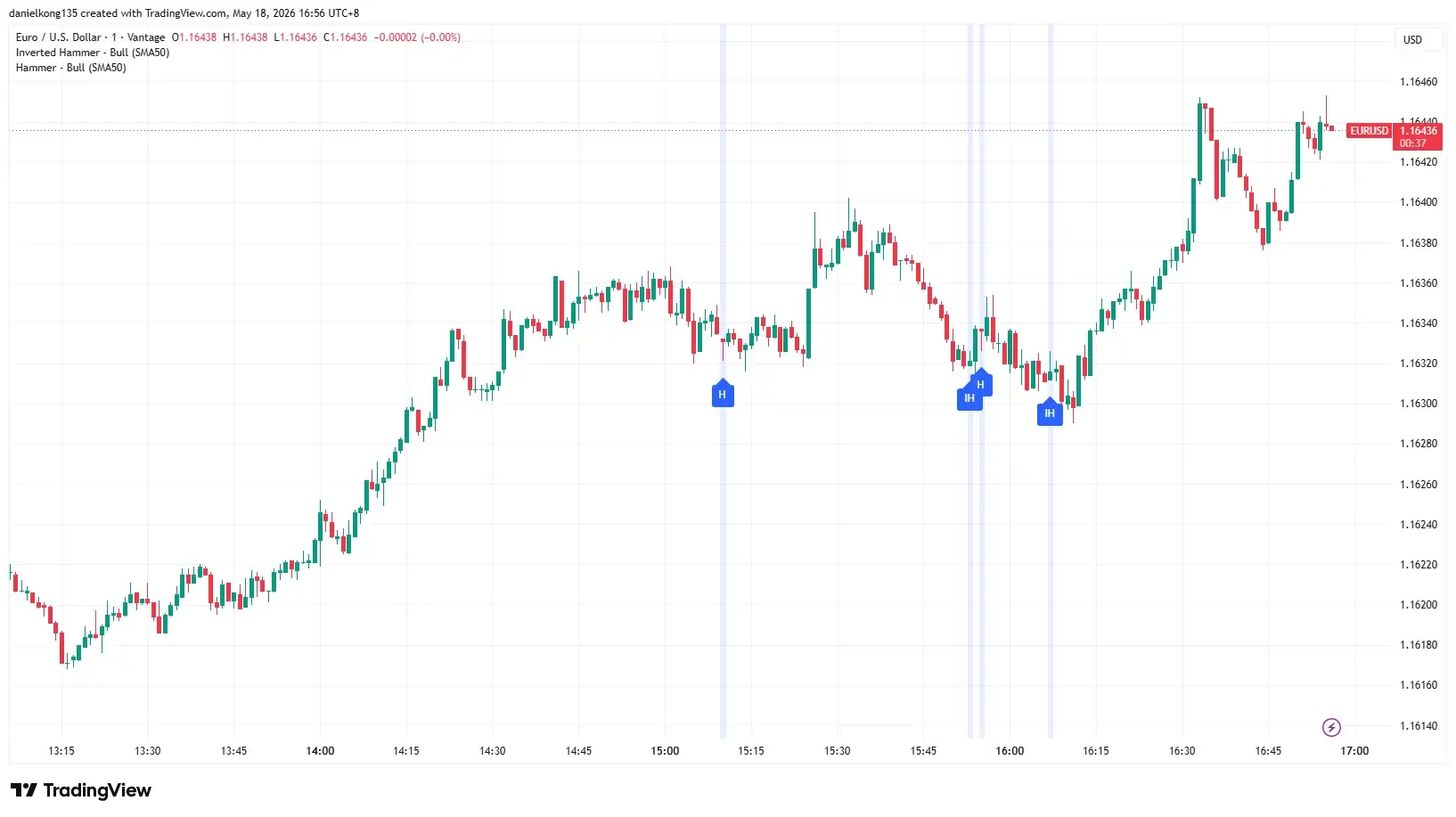
The scanner flagged four hammer-related signals on EUR/USD during the session.
By the afternoon session, EUR/USD had already built a clear intraday uptrend from its earlier low near 1.1617. The scanner then identified a Hammer around 15:05, followed by a small cluster of Hammer and Inverted Hammer signals between roughly 15:50 and 16:10, around the 1.1630–1.1632 area.
These signals appeared during short pullbacks within the broader upward move, rather than at the very start of a fresh reversal. That context matters. The scanner was not identifying a reversal from a major downtrend; it was highlighting brief dips where price tested lower levels before recovering.
The strongest follow-through came after the later signal cluster near 16:10. EUR/USD held around the pullback area, then continued higher into the final part of the chart, eventually moving back towards the 1.1643–1.1645 zone.
Across the visible chart, the range was roughly 25 to 30 pips, which makes even smaller lower-wick rejections meaningful on a 1-minute EUR/USD chart.
WTI Crude Oil: Six Signals With Mixed Follow-Through

WTI produced six hammer-related signals across the same visible session. The scanner flagged an Inverted Hammer and Hammer in quick succession near 13:25–13:30, a Hammer near 14:00, an Inverted Hammer around 15:10, a Hammer near 15:40, and a final Inverted Hammer near 16:30.
The outcomes were mixed. The early signals near 13:25–14:00 appeared during choppy intraday movement and did not lead to a sustained bullish reversal. The 14:00 Hammer was followed by a partial recovery, but the move later failed as sellers regained control.
The 15:10 Inverted Hammer is the clearest failed signal on the chart. Price briefly attempted to move higher after the signal, but the rebound did not hold. WTI then reversed sharply lower, falling into the 105.40–105.50 region by around 15:30.
| Time | Signal | Approximate Price Area | Outcome |
| ~13:25 | Inverted Hammer | ~106.85 | Downward move continued after a brief pause |
| ~13:30 | Hammer | ~106.70 | Downward move continued |
| ~14:00 | Hammer | ~106.40 | Partial recovery, but later failed |
| ~15:10 | Inverted Hammer | ~106.40 | Brief uptick, then sharp selloff |
| ~15:40 | Hammer | ~105.60 | Choppy recovery, no clean reversal |
| ~16:30 | Inverted Hammer | ~105.70 | Price remained range-bound into the close |
WTI’s visible session range was approximately USD1.80–USD1.90, from around 107.15 at the high to about 105.35 at the low. That is much wider than the EUR/USD chart across the same general window.
This matters because WTI’s 1-minute candles showed far greater volatility. In this type of market, candles can produce long wicks that meet the structural criteria for a Hammer or Inverted Hammer without confirming a meaningful shift in price direction. The scanner may identify the candle shape correctly, but the chart shows why shape alone is not enough.
What the Comparison Shows
The two charts show a simple point: a valid hammer shape does not always carry the same meaning. The scanner may identify the candle correctly, but the market around that candle decides whether the signal matters.
On EUR/USD, the signals appeared during an existing upward move. Price was already recovering, and the hammer-style candles formed during short pullbacks rather than during a messy, directionless market.
That made the EUR/USD signals easier to read. The chart produced fewer signals, but the follow-through was cleaner because the wider trend was already supportive.
WTI Crude Oil behaved differently. The chart produced more signals, but the session was far more volatile, with sharper drops, faster rebounds, and wider candle wicks.
This made the hammer shapes harder to interpret. Some signals led to small pauses, some failed quickly, and others appeared while the market was still moving heavily in both directions.
The main lesson is that the candle shape is only the starting point. A hammer becomes more meaningful when it appears in the right place, such as near a clear support area, after a pullback, or within a trend that is already showing signs of recovery.
In simple terms, EUR/USD gave fewer signals that were easier to read. WTI gave more signals, but the outcomes were less consistent.
Past performance is not a reliable indicator of future results. The above represents a market observation for educational purposes only and does not constitute financial advice.
Confirmation Methods and Their Relative Strength
A hammer on its own is a prompt, not a signal. The candle identifies a moment worth watching — it takes additional evidence to make it worth acting on. Traders generally look for multiple indicators pointing in the same direction before treating a hammer as a meaningful reversal candidate.
No single confirmation method is definitive. But some might carry more weight than others, and knowing the difference matters when conditions are ambiguous.
| Confirmation Method | What to Look For | Role in Analysis |
| Next candle close | Bullish candle closing above hammer’s high | The most direct test of follow-through — confirms buyers are still in control beyond the hammer session itself |
| Volume analysis | Above-average volume on the hammer candle | Validates the buyer recovery as broadly participated, not a thin-market bounce that could easily reverse |
| RSI reading | RSI below 30 (oversold zone) at time of hammer | Adds independent momentum evidence that selling pressure may be exhausted before the pattern even forms |
| Support level alignment | Hammer forms at key horizontal support, Fibonacci level, or moving average | Anchors the signal to a price level where buyers were already expected to appear, strengthening the structural case |
| MACD crossover | Bullish MACD crossover following hammer formation | Provides lagging confirmation that momentum has shifted — useful for traders who prioritise reduced risk over early entry |
Related Article: Adding Indicators to TradingView: RSI, MACD, and Moving Averages
What Are the Limitations of the Hammer Pattern?
The hammer pattern has several recognised limitations. False signals can still appear, especially during strong bearish trends where wider market sentiment outweighs the short-term buying pressure shown by the candle. In volatile markets such as gold or currency pairs like USD/INR — where intraday price swings can be particularly sharp — the risk of a false hammer signal is worth factoring carefully into any analysis.
It can also be subjective. One trader may see a valid hammer, while another may see a borderline spinning top or short-bodied candle, especially when the body-to-wick ratio is not clear.
The pattern only reflects short-term price behaviour. It does not show how far, or how long, a potential reversal may continue, so traders often look for confirmation from support levels, follow-through candles, volume, or other technical indicators before interpreting the signal.
Using the Hammer Pattern in Your Analysis
The hammer candlestick is effective as one piece of a larger analytical picture. On its own, it identifies a single session where buyers pushed back against sellers — useful context, but not a complete basis for any decision.
Combined with a clear prior downtrend, a key support level, a confirming candle, and corroborating data from volume or momentum indicators, the pattern can become a practical reference point in a broader technical framework.
For traders learning technical analysis, the hammer is often one of the first patterns worth studying precisely because it encodes a recognisable market dynamic in a single candle.
Understanding why the pattern matters — the exhaustion of selling pressure, the rejection of lower prices, the shift in intraday control — builds the kind of chart-reading intuition that applies across patterns, timeframes, and markets.
Frequently Asked Questions
What is the hammer candlestick pattern?
The hammer candlestick pattern is a single-candle formation that appears at the end of a downtrend. It features a small real body near the top of the candle’s price range, a long lower wick that is at least twice the length of the body, and little to no upper shadow. The pattern suggests that sellers pushed the price lower during the session but buyers stepped in and pushed the price back up before the close, potentially signalling that selling pressure may be exhausted.
Is the hammer candlestick bullish or bearish?
The hammer is generally considered a bullish reversal signal when it appears after a downtrend. It suggests that buyers may be regaining control after a sustained period of selling pressure. However, the colour of the hammer’s body — whether it closes higher or lower than its open — does not determine whether it is bullish.
Both green and red hammers can carry a bullish implication when the shape and context are correct. Traders typically seek confirmation from the following candle before drawing conclusions.
What is the difference between a hammer and a hanging man?
A hammer and a hanging man are structurally identical — both feature a small body near the top of the range and a long lower wick. The difference is context. A hammer appears after a downtrend and may signal a potential bullish reversal. A hanging man appears after an uptrend and may signal that bullish momentum is weakening, making it a potential bearish reversal signal. The same candle shape carries different implications depending on the trend that precedes it.
What is an inverted hammer candlestick?
An inverted hammer is a bullish reversal pattern that appears at the bottom of a downtrend, similar in context to a standard hammer but with an opposite structure. Instead of a long lower wick, the inverted hammer has a long upper wick and a small body near the bottom of the candle’s range.
It suggests buyers attempted to push the price higher during the session before meeting resistance. Because buyers did not maintain control to the close, the inverted hammer is generally considered a weaker signal than the standard hammer and typically requires stronger confirmation from the following candle.
How do traders set stop-loss levels when trading a hammer pattern?
A common approach is to place a stop-loss order just below the low of the hammer’s lower wick. The logic is straightforward: if the price falls below the hammer’s low after forming the pattern, the signal is considered invalidated — sellers have reasserted control and the expected reversal has not materialised.
This placement gives the trade a clearly defined risk level. In volatile conditions, some traders adjust the stop-loss slightly lower to account for short-term price fluctuations, though this increases the maximum potential loss on the trade. Individual risk tolerance varies and this is general information only, not a personal recommendation.
Can the hammer candlestick appear on any timeframe?
Yes, the hammer pattern can form on any timeframe — from one-minute intraday charts to weekly charts. However, reliability generally increases on higher timeframes. Daily chart hammers tend to produce more meaningful signals than those on sub-hourly charts, where noise in price data can create hammer-shaped candles without any genuine shift in market dynamics.
Weekly hammers, when they occur, are often treated as significant markers by technical analysts, though they appear far less frequently. Traders using the pattern on shorter timeframes often apply additional filters or require stronger confirmation to reduce the risk of false signals. In commodity markets such as gold, daily chart hammers forming near key support levels are frequently cited by technical analysts as particularly noteworthy reversal candidates, given how closely gold prices are tracked across global markets.
RISK WARNING: CFDs are complex financial instruments and carry a high risk of losing money rapidly due to leverage. You should ensure you fully understand the risks involved and carefully consider whether you can afford to take the high risk of losing your money before trading.
Disclaimer: The information is provided for educational purposes only and doesn’t take into account your personal objectives, financial circumstances, or needs. It does not constitute investment advice. We encourage you to seek independent advice if necessary. The information has not been prepared in accordance with legal requirements designed to promote the independence of investment research. No representation or warranty is given as to the accuracy or completeness of any information contained within. This material may contain historical or past performance figures and should not be relied on. Furthermore estimates, forward-looking statements, and forecasts cannot be guaranteed. The information on this site and the products and services offered are not intended for distribution to any person in any country or jurisdiction where such distribution or use would be contrary to local law or regulation.
Reference
- “Candlestick patterns: Charting your trading strategy – Britannica Money” https://www.britannica.com/money/candlestick-pattern-charts Accessed 18 May 2026
- “Relative Strength Index (RSI) – TradingView” https://www.tradingview.com/support/solutions/43000502338-relative-strength-index-rsi/ Accessed 20 May 2026