
Forex trading charts are the primary tool for tracking how currency pairs move over time. A forex trading chart plots the price of a currency pair on the vertical (price) axis against time on the horizontal axis, converting raw price data into a visual format that makes it possible to identify trends, spot patterns, and analyse market behaviour. Reading a chart starts with identifying the chart type, the timeframe, and the direction of the prevailing trend.
There are three core chart formats used in forex: line charts, bar (OHLC) charts, and candlestick charts. Candlestick charts are the most widely used because they show the open, high, low, and close for each time period in a single visual. Price movements are measured in pips — for most currency pairs, one pip equals a move of 0.0001 in the exchange rate.
For forex CFD traders, understanding how to read a chart is foundational. It underpins technical analysis, pattern recognition, and the ability to assess market context before making any trading decision.
Key Points
- Forex trading charts plot currency pair prices on a vertical axis against time on a horizontal axis. Each chart type (line, bar, candlestick) displays this data differently, with candlestick charts the most widely used because they show all four price points — open, high, low, close — at a glance.
- Price movements on forex charts are measured in pips. For most major pairs such as EUR/USD or GBP/USD, one pip equals a change of 0.0001 in the exchange rate. For JPY pairs such as USD/JPY, one pip equals 0.01.
- Chart analysis tools including support and resistance levels, moving averages, and the Relative Strength Index (RSI) can be applied on top of any chart type to assess trend direction, momentum, and key price zones.
What Is a Forex Trading Chart?
A forex trading chart is a visual representation of how a currency pair’s price has moved over a selected period. It plots price data on a graph, with the vertical axis showing the exchange rate and the horizontal axis representing time. This allows traders to quickly see historical trends, short-term fluctuations, and significant price levels.
Historical price charts shown throughout this article are for illustrative purposes only. Past performance is not a reliable indicator of future results.
These charts form the foundation of technical analysis in the foreign exchange market. By studying price movements, traders can identify patterns, assess market sentiment, and compare historical behaviour with current activity.
While the concept is straightforward, the detail a forex trading chart provides varies by format. Some focus on broad trends; others reveal granular price action across specific time periods. According to Babypips.com, a chart blends all market activity — from central bank interventions to retail order flow — into a single visual that technical traders can study and analyse [1].
How to Read a Forex Chart: The Axes and Pips
Every forex trading chart, regardless of type or platform, is built on two axes:
- Vertical axis (Y-axis): shows the exchange rate. A rising line means the base currency is gaining value against the quote currency; a falling line means the opposite.
- Horizontal axis (X-axis): shows time. Each bar or data point on the chart corresponds to a specific time period — one minute, one hour, one day, or longer — depending on the timeframe selected.
Price movements on forex charts are measured in pips (percentage in point). A pip is the standardised unit for expressing the change in value between two currencies. For most major currency pairs, one pip refers to the fourth decimal place — equal to 0.0001. For JPY pairs such as USD/JPY, one pip is the second decimal place, equal to 0.01.
A practical example: if EUR/USD moves from 1.1050 to 1.1051, that is a one-pip move. Spreads vary depending on market conditions and account type. The spread — the difference between the bid price (sell price) and ask price (buy price) — represents a transaction cost when trading and is visible on live forex charts.
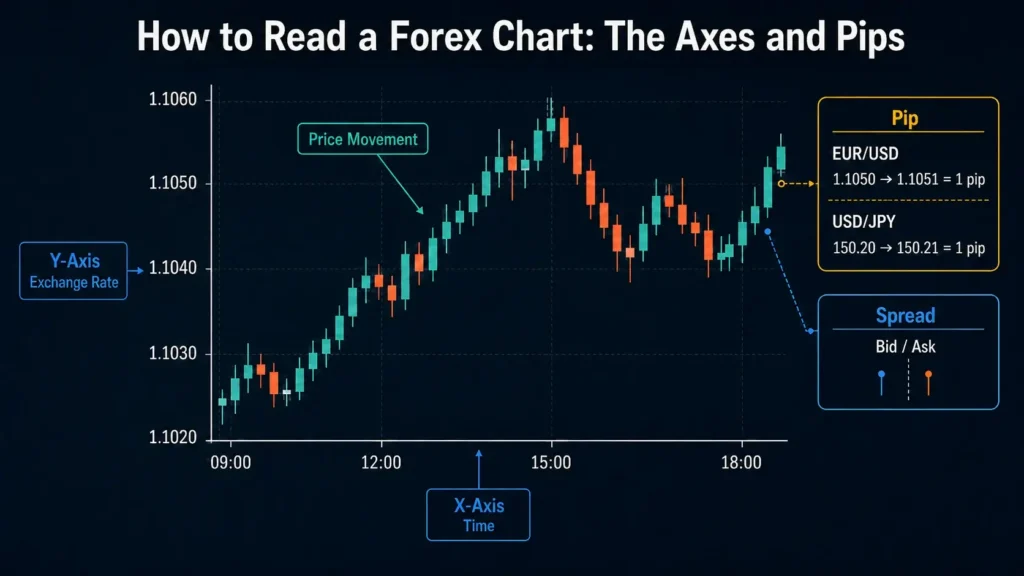
Image 1: Example of EUR/USD forex chart
Understanding pip values matters because they determine how profit and loss are calculated. A 50-pip move on a standard lot (100,000 units) of EUR/USD equates to approximately $500. The same 50-pip move on a micro lot (1,000 units) equates to approximately $5. This is why chart-reading skills and position sizing are closely connected in practice.
For a worked framework, see how to calculate lot size and pip values.
Types of Forex Trading Charts
Forex charts come in several formats. The three most common are line charts, bar (OHLC) charts, and candlestick charts. A fourth format, Heikin-Ashi, is used by traders who want a smoother view of trend direction.
| Chart Type | Data Shown | Best Used For | Detail Level |
| Line | Close price only | Long-term trend identification | Low |
| Bar (OHLC) | Open, High, Low, Close | Range and sentiment analysis | Medium |
| Candlestick | Open, High, Low, Close | Pattern recognition, all timeframes | High |
| Heikin-Ashi | Averaged OHLC values | Smoothed trend direction | Medium |
Table 1: Comparison of forex chart types
Line Chart in Forex Trading
A line chart is the simplest type of forex chart, plotting closing prices over a set period and connecting them with a continuous line. This format makes it easy to identify the overall trend direction without the distraction of intraday fluctuations.
Line charts are effective for comparing multiple currency pairs or identifying long-term directional patterns. They do not show the open, high, or low for each period, which limits their usefulness for analysing price action within a specific session.
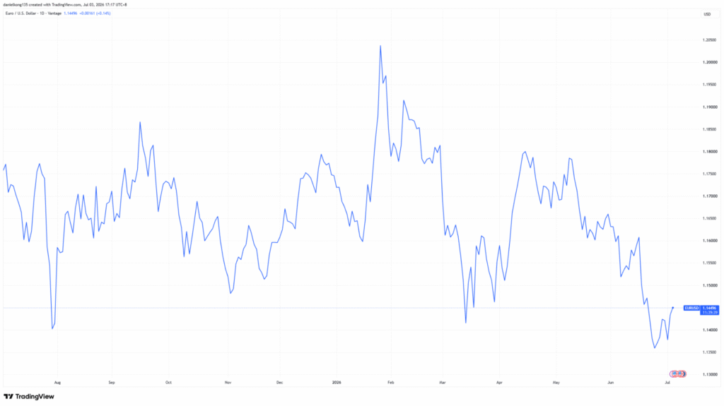
Chart 1: EUR/USD daily line chart. Source: https://www.tradingview.com/x/s0Vp5Yfd/
Bar Chart in Forex (OHLC Chart)
A bar chart, also known as an OHLC (Open, High, Low, Close) chart, provides more detail than a line chart. Each vertical bar shows the highest and lowest prices reached during a specific period, while small horizontal ticks on either side indicate the opening and closing prices.
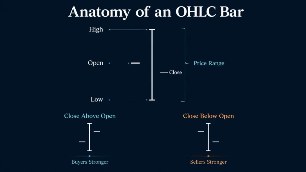
Image 2: Anatomy of a bar chart (OHLC)
Bar charts help traders see both the price range within a period and where the market closed within that range. This is useful for spotting volatility and gauging whether buyers or sellers had more control during a given period.
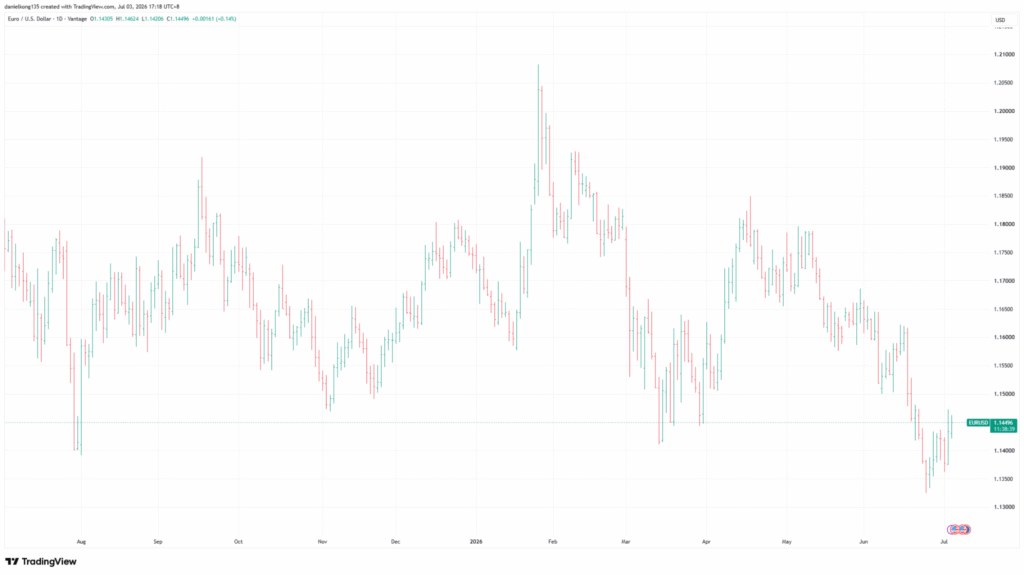
Chart 2: EUR/USD bar chart example. Source: https://www.tradingview.com/x/bRLKn7lA/
Candlestick Chart in Forex Trading
Candlestick charts are the most widely used format in forex trading. Each candlestick represents price movement over a set time period, displaying the open, high, low, and close. A filled or coloured body signals a price decline; a hollow or lighter body indicates a price increase.
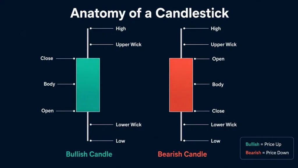
Image 3: Candlestick anatomy
Beyond basic price representation, candlestick patterns allow traders to recognise recurring formations such as doji, engulfing, and hammer patterns. Candlestick charts originated with Japanese rice traders in the 18th century and remain the dominant charting format among retail forex traders today because of their clarity and the range of price-action patterns they make visible.
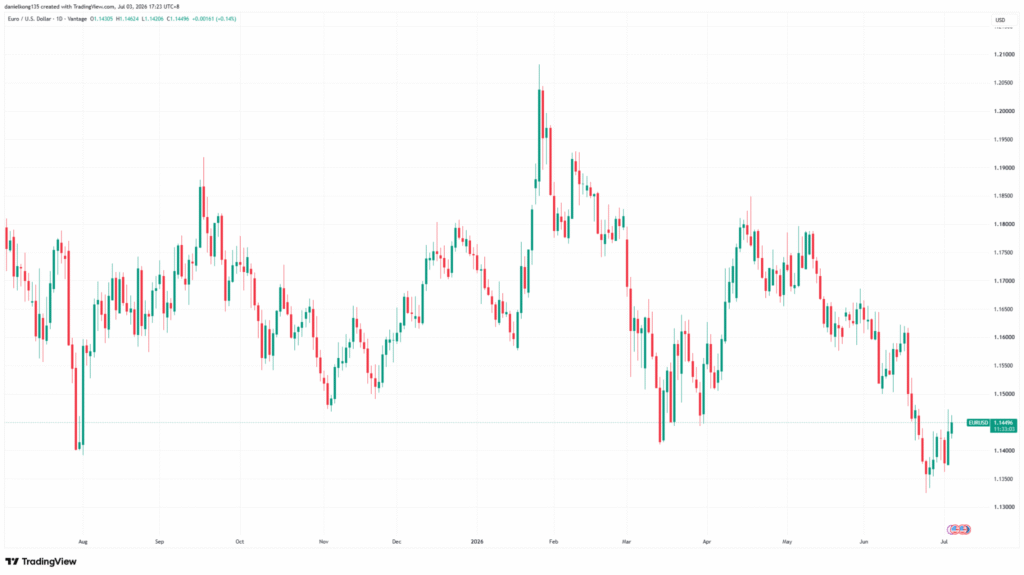
Chart 3: EUR/USD candlestick chart example. Source: https://www.tradingview.com/x/Cmv2P3jx/
By learning how to read different chart types, traders can better interpret market movements and price trends. For more on the forex market context, explore our guide on why traders use forex CFDs.
Heikin-Ashi Charts
Heikin-Ashi charts are a variation of candlestick charts. Instead of plotting actual open and close prices, each bar uses averaged values from the current and previous period. This smoothing effect makes trend direction easier to read but means the bars do not reflect true OHLC prices.
Many traders use Heikin-Ashi alongside standard candlestick charts for trend confirmation rather than as a replacement. When a Heikin-Ashi chart shows several consecutive bars of the same colour with no lower wicks (in an uptrend), it often indicates a relatively clean directional move. It is less reliable for identifying precise entry and exit levels, where the actual OHLC data matters.
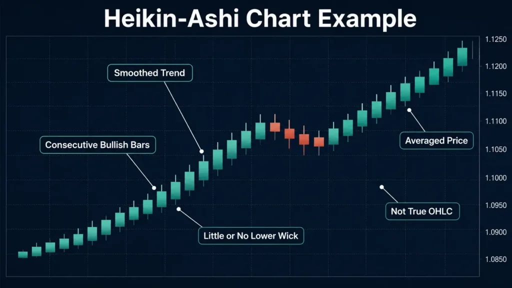
Image 4: Heikin-Ashi chart example for EUR/USD
Understanding Timeframes in Forex Trading Charts
Timeframes define how price data is grouped and displayed on a forex chart. The available range typically runs from one-minute intervals to monthly periods, with each timeframe offering a different perspective on market movement.
Short timeframes such as one-minute or five-minute charts highlight rapid price changes and are often used to study short-term volatility. Longer timeframes such as daily or weekly charts filter out minor fluctuations, making it easier to identify the broader trend in a currency pair’s price history. Market activity can also vary across forex trading sessions, which may affect liquidity and volatility.
A common approach across experience levels is multi-timeframe analysis: identify the prevailing trend on a higher timeframe (daily or weekly), then zoom into a shorter timeframe (one-hour or 15-minute) for a closer look at price action. This method is commonly used to provide additional context when interpreting price movements across different timeframes.
How to Identify Trends on a Forex Chart
Trend identification is one of the core skills in forex chart analysis. Price action on any chart moves in one of three directions:
| Trend Type | What It Looks Like on the Chart | What It Suggests |
| Uptrend | Consecutive higher highs and higher lows | Buyers are in control; the base currency is strengthening against the quote |
| Downtrend | Consecutive lower highs and lower lows | Sellers are in control; the base currency is weakening |
| Sideways (range-bound) | Price oscillates between a horizontal support and resistance band | No clear directional bias; the market is consolidating |
Table 2: Trend types on a forex trading chart
Trend lines are drawn by connecting successive lows in an uptrend or successive highs in a downtrend. A trend line that has been tested and held across multiple occasions is generally considered more significant than one touched only once.
In practice, trends are rarely clean. Price retraces against the prevailing direction before resuming. The critical question is whether the overall sequence of highs and lows remains intact. When an uptrend produces a lower low for the first time, or a downtrend produces a higher high, it may signal a potential change in market direction — though confirmation across multiple bars is typically needed before drawing conclusions.
Forex Chart Analysis Tools
Chart analysis tools help traders interpret price data more effectively by highlighting levels, smoothing trends, and measuring momentum. Three of the most commonly used in forex analysis are support and resistance levels, moving averages, and the Relative Strength Index (RSI).
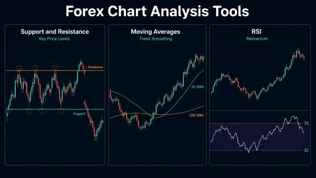
Image 5: Examples of forex chart analysis tools
Support and Resistance Levels
Support and resistance levels are horizontal reference points drawn where price has previously reversed or paused. Support marks a level where buying interest has been strong enough to prevent further declines; resistance marks a price point where selling pressure has consistently capped upward movement.
These levels carry significance because they reflect areas where a large number of traders have previously acted. Price often reacts at these zones on subsequent visits. When a support level breaks convincingly — meaning price closes below it rather than briefly dipping through it — the former support may then act as resistance on any retest. The reverse applies to broken resistance levels becoming support. This behaviour is not guaranteed but is one of the more consistent observations in technical chart analysis.
Moving Averages
A moving average smooths out price fluctuations by calculating the average closing price over a set number of periods. The 50-day and 200-day simple moving averages (SMA) are widely watched reference points because they appear on the charts of a broad range of market participants.
When price is above a moving average, it often indicates a general uptrend; when it is below, it may suggest a downtrend. Moving averages work less reliably in sideways or range-bound markets, where price oscillates above and below the line repeatedly without establishing a clear directional relationship. This is the primary limitation of the indicator and one reason traders often use multiple tools in combination rather than relying on any single signal.
RSI (Relative Strength Index)
The Relative Strength Index (RSI) measures the speed and magnitude of recent price changes, oscillating between 0 and 100. Values above 70 may suggest overbought conditions, where upward momentum may be losing force; values below 30 may indicate oversold conditions, where downward momentum may be weakening [2].
RSI is a momentum indicator, not a directional signal on its own. One common limitation: in a strong uptrend, RSI can remain above 70 for an extended period without a significant reversal. In this context, an RSI reading above 70 reflects strength rather than an imminent turning point. This is why traders typically use RSI alongside price action or other tools rather than as a standalone entry signal. For a broader comparison, see our guide to trading indicators. Many charting platforms allow RSI and other indicators to be applied across major currency pairs.
For additional educational content, readers may also explore guides covering forex trading strategies.
Common Forex Chart Patterns
Chart patterns are recurring formations on trading charts that can provide context for interpreting price behaviour and potential momentum shifts. They are not predictive guarantees but can help frame analysis when combined with other tools.
Some of the most commonly observed patterns in forex trading include:
- Head and Shoulders: Often associated with a potential trend reversal from bullish to bearish.
- Cup and Handle: Typically seen during an uptrend continuation following a period of consolidation.
- Double Top / Double Bottom: Formations that may indicate a reversal at significant price levels.
- Wedge: Can be either bullish or bearish depending on its slope and breakout direction.
- Flag and Pennant: Short-term continuation patterns that often follow a sharp price move.
- Triangles (Symmetrical, Ascending, Descending): Consolidation phases that can break in either direction, with the slope sometimes indicating the more likely outcome.
When analysing these patterns on a forex trading chart, many traders combine them with moving averages, support and resistance levels, or RSI to add further context to their analysis.
Technical indicators and chart patterns are analytical tools only and should not be interpreted as reliable predictors of future market performance. Market movements can be influenced by many factors, and no analytical method guarantees outcomes.

Image 6: Examples of common forex chart patterns
How to Analyse a Forex Trading Chart: A Practical Approach
A repeatable process helps reduce guesswork when reading forex charts. The following six-step sequence provides a practical starting framework:
- Select your chart type. Start with a candlestick chart — it shows the most information per bar. Line charts are better suited for identifying long-term directional bias across multiple pairs.
- Set your timeframe. Begin with a higher timeframe (daily or weekly) to identify the prevailing trend before moving to a shorter timeframe for closer detail. This top-down approach is commonly used to align analysis with the broader trend direction.
- Identify the trend. Look at the sequence of highs and lows. Is the price making higher highs and higher lows (uptrend), lower highs and lower lows (downtrend), or moving sideways? If the pattern is unclear, the market is likely in consolidation.
- Mark key support and resistance levels. Identify price areas where the market has previously reversed or consolidated. These zones provide reference points for understanding potential reactions.
- Apply indicators where relevant. Add a moving average or RSI to help assess trend strength or momentum. A common approach: use a 50-period SMA to define the trend direction on the current timeframe; apply RSI to gauge whether momentum supports continuation or shows early signs of fading.
- Look for chart patterns. Check whether any recognisable formations are present — triangles, head-and-shoulders, flags — and how they relate to the prevailing trend and the levels you have already marked.
A Vantage demo account can be used to practise chart analysis in a simulated trading environment.
Reading Forex Trading Charts: What to Focus On
Forex trading charts are the starting point for any form of technical analysis. The ability to identify the trend, locate key price levels, and interpret indicator signals on a chart is a foundational skill that applies across all trading timeframes and currency pairs.
The tools covered in this guide — chart types, pips, trend identification, support and resistance, moving averages, RSI, and chart patterns — are the same tools professional and retail forex CFD traders apply daily. With continued study and experience, users may become more familiar with applying chart-reading techniques and interpreting market information.
Frequently Asked Questions
How do you read a forex trading chart?
Start by identifying the chart type (line, bar, or candlestick), the currency pair displayed, and the timeframe selected. The vertical axis shows the exchange rate; the horizontal axis shows time. From there, assess the overall direction of price movement to identify the prevailing trend, then mark any significant support and resistance levels. Technical indicators such as moving averages or RSI can be overlaid to provide additional context on trend strength or momentum. Each of these elements provides a different layer of information; experienced traders read them in combination rather than in isolation.
What is a pip in forex trading charts?
A pip (percentage in point) is the standardised unit used to measure price movement on forex charts. For most major currency pairs such as EUR/USD or GBP/USD, one pip equals a change of 0.0001 in the exchange rate. For JPY pairs such as USD/JPY, one pip equals 0.01. When you observe a price move on a forex trading chart, the size of that move is expressed in pips. Understanding pip values is essential for assessing potential profit, loss, and risk when trading forex CFDs, since position sizing and stop distances are calculated in pips.
How to analyse forex trading charts for beginners?
Beginners are often best served starting with candlestick charts on a daily timeframe. This provides a clear view of the prevailing trend without the noise of shorter-term price action. The focus should initially be on three things: identifying the overall trend direction (higher highs and higher lows for an uptrend; lower highs and lower lows for a downtrend), marking visible support and resistance levels, and understanding what pip values represent on the pairs being watched. Practising on a demo account with real live prices, without capital at risk, is one of the most effective ways to build chart-reading fluency.
What is the difference between line, bar, and candlestick charts in forex?
A line chart plots only the closing price for each period, connected into a continuous line. It is the simplest format and best suited for identifying broad directional trends across longer timeframes. A bar chart (OHLC) adds the open, high, low, and close for each period, showing more detail about the price range and where the market closed within it. A candlestick chart displays the same four data points as a bar chart but in a visual format that makes it easier to read at a glance — the body represents the distance between open and close, while the wicks show the high and low. Most forex traders use candlestick charts as their primary format because of the range of patterns they make visible.
How do support and resistance levels appear on a forex chart?
Support and resistance levels appear as horizontal lines drawn at price areas where the market has previously paused, reversed, or consolidated. A support level is where buying interest has historically been sufficient to prevent further declines; a resistance level is where selling pressure has previously capped upward movement. These levels carry practical significance because many market participants watch the same price zones. When price approaches a previously established level, the reaction — whether the level holds or breaks convincingly — can provide meaningful context for assessing the current state of the market.
What timeframe should I use when reading forex trading charts?
The appropriate timeframe depends on how long you intend to hold a position and how frequently you plan to review the market. Traders holding positions for days or weeks typically start with the daily chart to identify the broad trend. Those focused on shorter-term price action may use the one-hour or four-hour chart. A standard approach is to use a higher timeframe to identify the prevailing trend direction, then switch to a lower timeframe to look at price action in closer detail. Regardless of timeframe, the method for reading charts — identifying trend, marking levels, applying indicators — remains the same.
RISK WARNING: CFDs are complex financial instruments and carry a high risk of losing money rapidly due to leverage. You should ensure you fully understand the risks involved and carefully consider whether you can afford to take the high risk of losing your money before trading.
Disclaimer: The information is provided for educational purposes only and doesn’t take into account your personal objectives, financial circumstances, or needs. It does not constitute investment advice. We encourage you to seek independent advice if necessary. The information has not been prepared in accordance with legal requirements designed to promote the independence of investment research. No representation or warranty is given as to the accuracy or completeness of any information contained within. This material may contain historical or past performance figures and should not be relied on. Furthermore estimates, forward-looking statements, and forecasts cannot be guaranteed. The information on this site and the products and services offered are not intended for distribution to any person in any country or jurisdiction where such distribution or use would be contrary to local law or regulation.
References
-
- “3 Types of Price Charts and How to Read Them” — Babypips.com https://www.babypips.com/learn/forex/types-of-charts Accessed 29 June 2026
- “What is a Pip in Forex Trading?” — FOREX.com https://www.forex.com/en/learn-trading/what-is-a-pip/ Accessed 29 June 2026